SHOW HOUSE
SHOW HOUSE
SHOW HOUSE
|
|
|
A Seamless Snack Ordering App for a Movie Theater
A Seamless Snack Ordering App for a Movie Theater
A Seamless Snack Ordering App for a Movie Theater
Product
Product
Mobile App
Mobile App
My Role
My Role
UI / UX Designer
UI / UX Designer
Skills
Skills
UI/UX Design
UI/UX Design
User Testing
User Testing
Prototyping
Prototyping
Timeline
Timeline
Q1 2023 - Q3 2024
Q1 2023 - Q3 2024
A hardworking immigrant with a packed schedule.
A hardworking immigrant with a packed schedule.
A hardworking immigrant with a packed schedule.

Andre loves going to the movies,
Andre loves going to the movies,
Andre loves going to the movies,
but
but
but
he often skips snacks because of
long queues and language barriers.
he often skips snacks because of
long queues and language barriers.
he often skips snacks because of
long queues and language barriers.

" I wish ordering snacks was easier, I could really enjoy some popcorn right now"
" I wish ordering snacks was easier, I could really enjoy some popcorn right now"
" I wish ordering snacks was easier, I could really enjoy some popcorn right now"
-Andre, sitting in the theater while watching his movie. -
-Andre, sitting in the theater while watching his movie. -
-Andre, sitting in the theater while watching his movie. -
but
but
but
What if we could make ordering snacks as effortless as enjoying a movie?
What if we could make ordering snacks as effortless as enjoying a movie?
What if we could make ordering snacks as effortless as enjoying a movie?
Introducing the,
Introducing the,
Introducing the,
A hassle-free way to enjoy snacks at the movies.
A hassle-free way to enjoy snacks at the movies.
A hassle-free way to enjoy snacks at the movies.
With the SHOW HOUSE app, users can order snacks in just a few taps.
With the SHOW HOUSE app, users can order snacks in just a few taps.
With the SHOW HOUSE app, users can order snacks in just a few taps.
No more long lines—snacks are delivered straight to their seat at their preferred time.
No more long lines—snacks are delivered straight to their seat at their preferred time.
No more long lines—snacks are delivered straight to their seat at their preferred time.
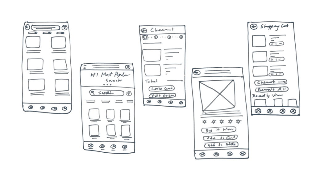
Starting with Paper Wireframes
Starting with Paper Wireframes
Starting with Paper Wireframes
Before diving into digital design, I sketched out different layouts and user flows to explore the best way to make snack ordering effortless.
Before diving into digital design, I sketched out different layouts and user flows to explore the best way to make snack ordering effortless.
Before diving into digital design, I sketched out different layouts and user flows to explore the best way to make snack ordering effortless.
From Paper to Pixels
From Paper to Pixels
From Paper to Pixels
Next, I transformed my paper sketches into a functional digital prototype in Figma.
Next, I transformed my paper sketches into a functional digital prototype in Figma.
Next, I transformed my paper sketches into a functional digital prototype in Figma.
With the prototype ready, it was time to put it to the test. I conducted a usability study to observe real users in action. This helped uncover key insights to refine the experience before moving into high-fidelity designs.
With the prototype ready, it was time to put it to the test. I conducted a usability study to observe real users in action. This helped uncover key insights to refine the experience before moving into high-fidelity designs.
With the prototype ready, it was time to put it to the test. I conducted a usability study to observe real users in action. This helped uncover key insights to refine the experience before moving into high-fidelity designs.
Usability Study: Key Findings
Usability Study: Key Findings
Usability Study: Key Findings
Users need an effortless way to access the cart after adding a product.
Users need an effortless way to access the cart after adding a product.
Users want an alternative way to return to the home screen after placing an order.
Users want an alternative way to return to the home screen after placing an order.
Users prefer to adjust the delivery time through a clock interface.
Users prefer to adjust the delivery time through a clock interface.
High-Fidelity Design 001: A Step Closer
High-Fidelity Design 001: A Step Closer
High-Fidelity Design 001: A Step Closer
I added color, improved copy, and icons to the lo-fi wireframes, transforming them into a fully functional high-fidelity prototype.
I added color, improved copy, and icons to the lo-fi wireframes, transforming them into a fully functional high-fidelity prototype.
I added color, improved copy, and icons to the lo-fi wireframes, transforming them into a fully functional high-fidelity prototype.
I believed this was the final design—until I conducted another round of user testing with the high-fidelity prototype.
Here’s what I discovered...
I believed this was the final design—until I conducted another round of user testing with the high-fidelity prototype.
Here’s what I discovered...
I believed this was the final design—until I conducted another round of user testing with the high-fidelity prototype.
Here’s what I discovered...
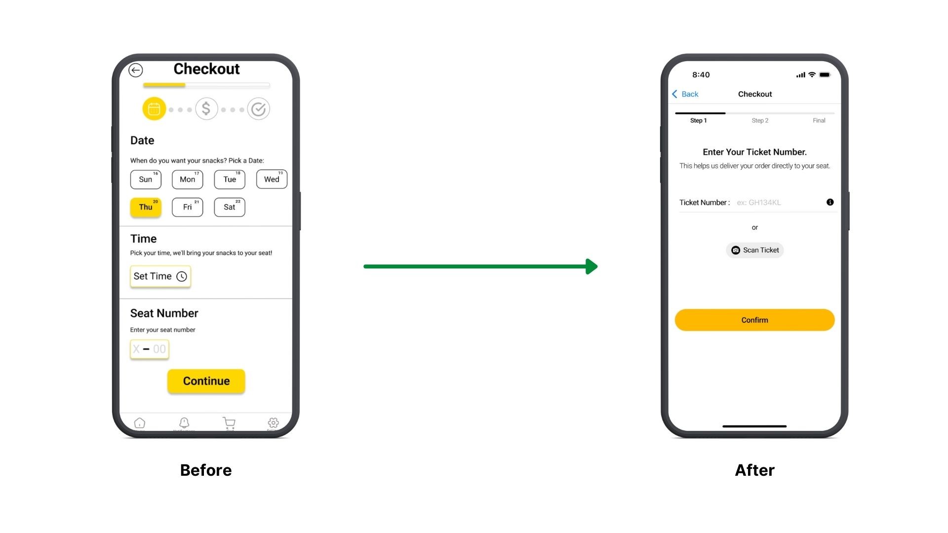
Manual input felt frustrating – 4 out of 5 users found entering the date, time, and seat number manually to be too much work.
Manual input felt frustrating – 4 out of 5 users found entering the date, time, and seat number manually to be too much work.
Manual input felt frustrating – 4 out of 5 users found entering the date, time, and seat number manually to be too much work.
Bright yellow caused eye strain – The main brand color had low contrast with the white background, making it uncomfortable for some users.
Bright yellow caused eye strain – The main brand color had low contrast with the white background, making it uncomfortable for some users.
Bright yellow caused eye strain – The main brand color had low contrast with the white background, making it uncomfortable for some users.
Cluttered and outdated UI – 3 out of 5 users felt that the homepage looked cluttered and outdated, making them question the brand’s credibility.
Cluttered and outdated UI – 3 out of 5 users felt that the homepage looked cluttered and outdated, making them question the brand’s credibility.
Cluttered and outdated UI – 3 out of 5 users felt that the homepage looked cluttered and outdated, making them question the brand’s credibility.
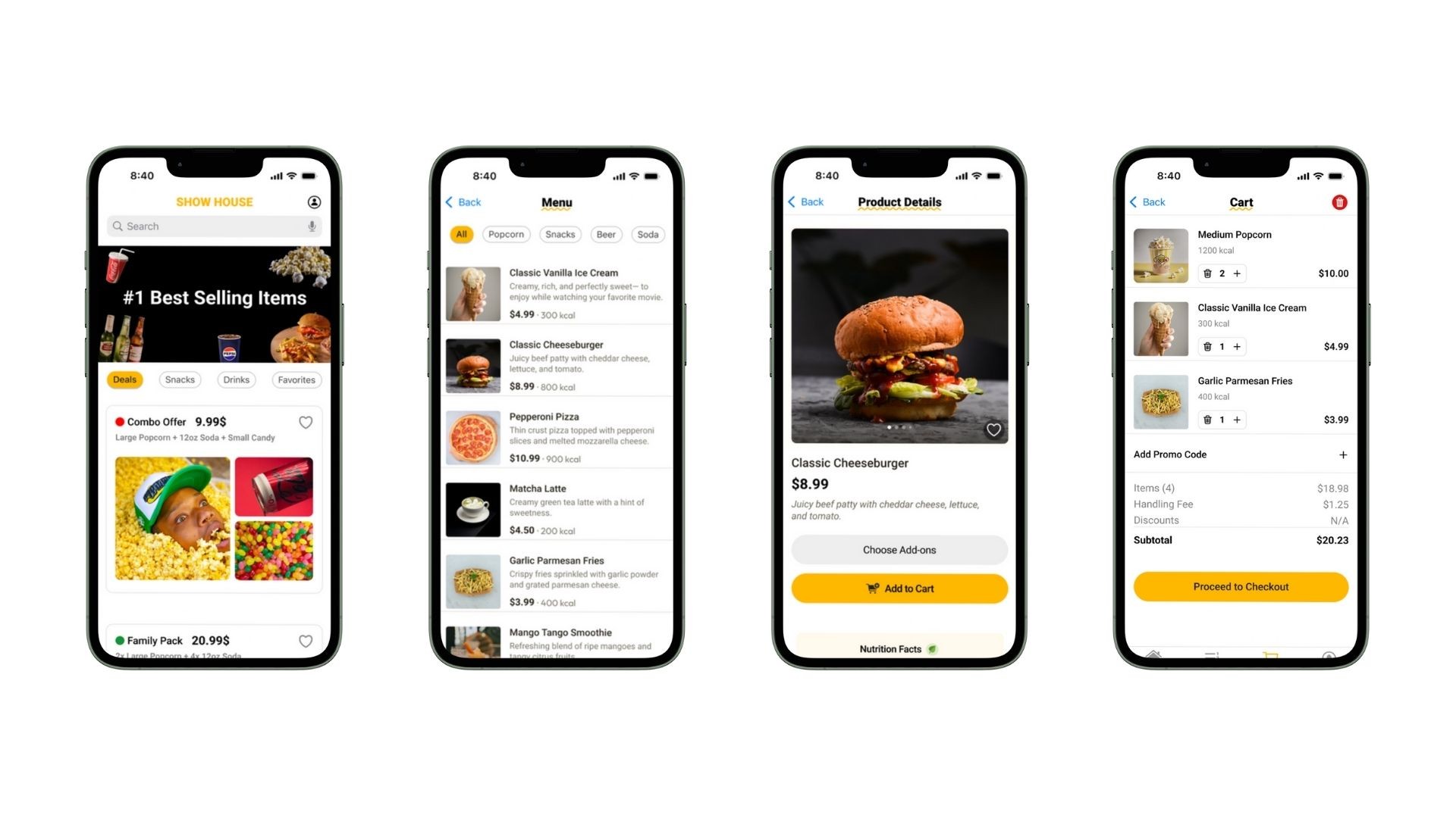
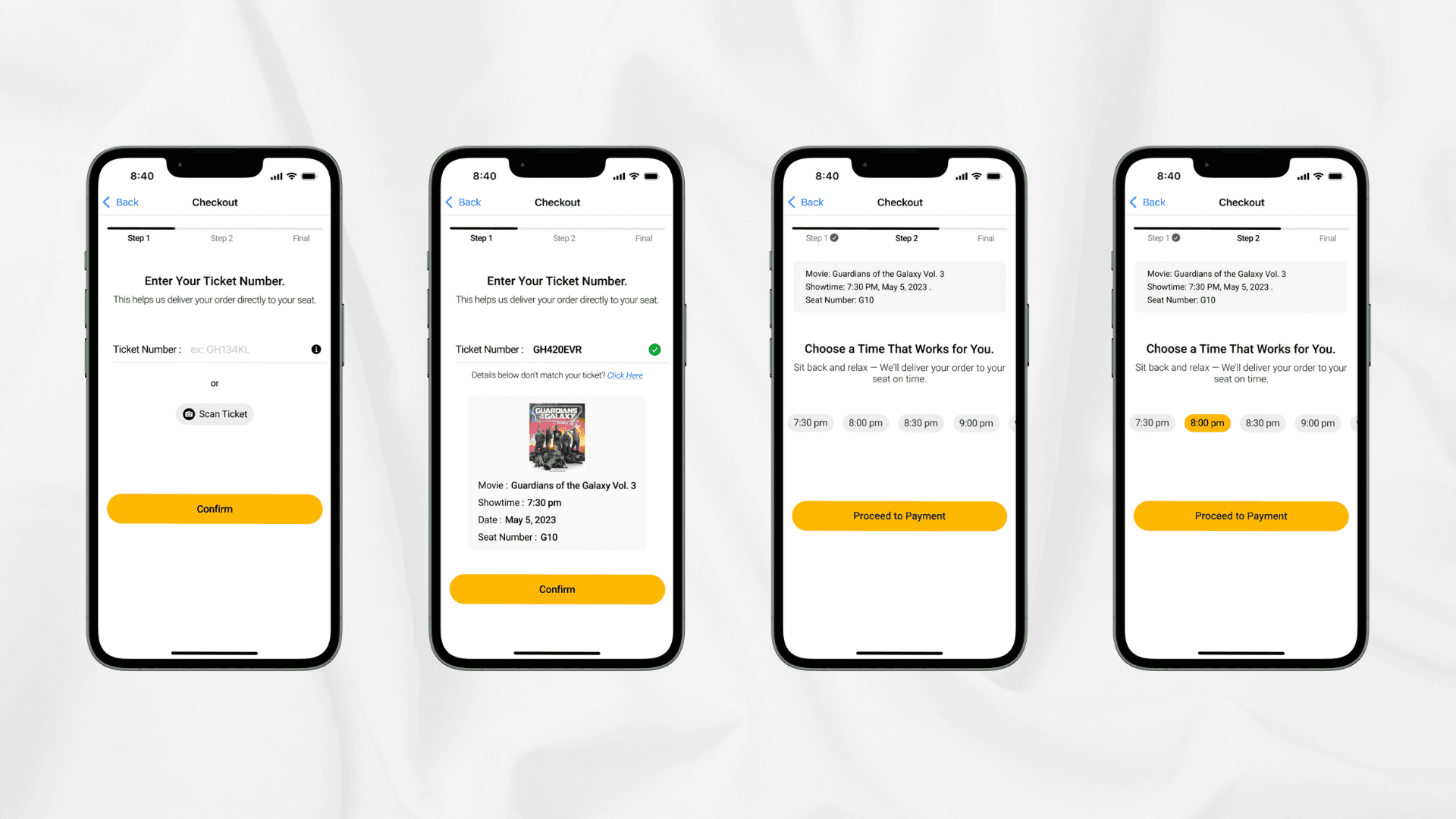
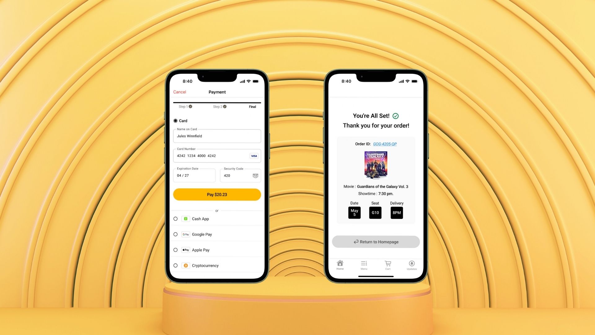
Instead of entering the date, time, and seat number manually, users can now simply enter their ticket number or scan their ticket with a single tap— making the process faster and more accessible.
Instead of entering the date, time, and seat number manually, users can now simply enter their ticket number or scan their ticket with a single tap— making the process faster and more accessible.
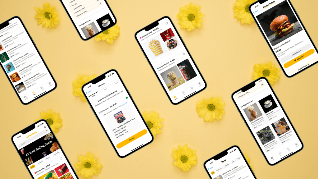
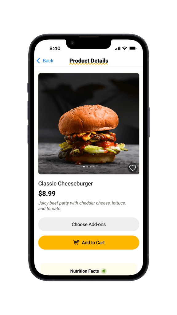
Here are the key screens from the high-fidelity prototype.
Here are the key screens from the high-fidelity prototype.
Andre—and countless other moviegoers who once struggled with typical snack ordering process, can now enjoy their movies worry-free, all while savoring their favorite snacks.
Andre—and countless other moviegoers who once struggled with typical snack ordering process, can now enjoy their movies worry-free, all while savoring their favorite snacks.
Andre—and countless other moviegoers who once struggled with typical snack ordering process, can now enjoy their movies worry-free, all while savoring their favorite snacks.

I learned that product design is a non-linear path— it takes time, multiple rounds of user testing, and continuous iteration based on feedback to create a truly user-friendly experience.
I learned that product design is a non-linear path— it takes time, multiple rounds of user testing, and continuous iteration based on feedback to create a truly user-friendly experience.
I learned that product design is a non-linear path— it takes time, multiple rounds of user testing, and continuous iteration based on feedback to create a truly user-friendly experience.
Thank you for reading!
I appreciate your time and hope you enjoyed it.
Thank you for reading!
I appreciate your time and hope you enjoyed it.